(aka “Numerous Devious Plots Discovered”)")
My SQL for Data Science Capstone Project: Country Data and Olympic Success (Part 2d)(aka “Numerous Devious Plots Discovered”)
Ok. So I have my main working tables, Athletes and Countries, (finally) done…
(tl;dr the first four posts in this series… I’m looking at connections between population and economic metrics and country success at the olympics. To start at the beginning, check out part 1.)
(Standard warning in all my posts. I’m a beginner. Nothing below should be taken as the best way of doing things, a good way of doing things, or even a right way of doing things. If you think you know better than me, you probably do. Please comment with better practices)
So where was I… The percentages of urbanization are going to need some work. 13 countries have “N.A.” as an entry. Still have some data cleaning to do.
sqlit("SELECT * FROM Urban_Pct WHERE Urban_Pop_Pct = 'N.A.'")Country Urban_Pop_Pct
0 Venezuela N.A.
1 Hong Kong N.A.
2 Singapore N.A.
3 Kuwait N.A.
4 Puerto Rico N.A.
5 Macao N.A.
6 Guadeloupe N.A.
7 Monaco N.A.
8 Gibraltar N.A.
9 Palau N.A.
10 Anguilla N.A.
11 Nauru N.A.
12 Holy See N.A.These are not non-urban places nor are they countries without olympic athletes, I don’t want them excluded. Maybe I can find the numbers elsewhere and stick them in.
The CIA has some stats at https://www.cia.gov/library/publications/the-world-factbook/fields/349.html. Let’s see how they jive with my numbers. I have Brazil at 88%, CIA… 87.1%. Looks good. Ukraine 69%, CIA… 69.6%. This works. I’ll hand change the data.
Cool. Now I want to change those numbers from objects to floats…
country_populations['Urban_Pop_Pct'] =
country_populations['Urban_Pop_Pct'].str[:-1] #Strips the %
country_populations['Urban_Pop_Pct'] =
country_populations['Urban_Pop_Pct'].astype(float).div(100)
#makes it a float then makes it a decimalThanks to https://stackoverflow.com/questions/50686004/change-column-with-string-of-percent-to-float-pandas-dataframe and https://www.geeksforgeeks.org/change-data-type-for-one-or-more-columns-in-pandas-dataframe/ for the guidance there.
So, let’s run some numbers. Of all the countries that have sent athletes to the Olympics (Noting that North Korea, Taiwan, and Yugoslavia are excluded. The Soviet Union’s medals belong to Russia. And Czechoslovakia’s medals belong to the Czech Republic)…
sqlit("SELECT Country, Count(*) as Gold_Medals FROM Athletes WHERE
Medal = 'Gold' GROUP BY Country ORDER BY Count(*) DESC")
Country Gold_Medals
0 United States 2638
1 Russia 1472
2 Germany 1301
3 United Kingdom 678
4 Italy 575
... ... ...
84 Ecuador 1
85 Cote d'Ivoire 1
86 Costa Rica 1
87 Burundi 1
88 Bahrain 1(Saved that as Golds_Per_Country)
89 countries have won gold medals led by the US, Russia/USSR, and Germany (including the east and west flavors).
sqlit("SELECT Country, Count(*) as ALL_Medals FROM Athletes WHERE Medal != 'None' GROUP BY Country ORDER BY Count(*) DESC")Country ALL_Medals
0 United States 5637
1 Germany 3756
2 Russia 3661
3 United Kingdom 2068
4 France 1777
... ... ...
118 Djibouti 1
119 Cyprus 1
120 Botswana 1
121 Bermuda 1
122 Barbados 1(Saved that as Medals_Per_Country)
123 countries have one medals with the US on top again and Russia and Germany flipped.
Quartiles. I wanted to break the data up into quartiles via SQL, but that was a mess. So I just did it in the dataframe via pandas. Easy. (Thanks again to the Geeks for showing how easy it is!)
Gold_By_Country['Quartile_Rank'] =
pd.qcut(Gold_By_Country['Gold_Medals'], q = 4, labels = False)
#create the quartiles
sqlit('SELECT * FROM Gold_By_Country')
Country	Gold_Medals	Quartile_Rank
0	United States	2638	3
1	Russia	1472	3
2	Germany	1301	3
3	United Kingdom	678	3
4	Italy	575	3
...	...	...	...
84	Ecuador	1	0
85	Cote d'Ivoire	1	0
86	Costa Rica	1	0
87	Burundi	1	0
88	Bahrain	1
Sweet. Long story short I made a quartiles dataframe too. And plotted it!
Gold_By_Quartile = sqlit('SELECT Quartile_Rank, SUM(Gold_Medals) as
Golds FROM Gold_By_Country GROUP BY Quartile_Rank')
Quartile_Rank Golds
0 0 38
1 1 197
2 2 1260
3 3 11508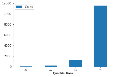
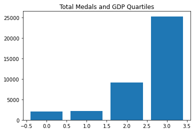
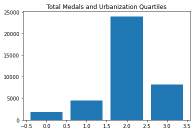
So the top quartile of countries win a lot of golds, then it goes down fast. Let’s do the same with the total medal count.
	Country	All_Medals	Quartile_Rank
0	United States	5637	3
1	Germany	3756	3
2	Russia	3661	3
3	United Kingdom	2068	3
4	France	1777	3
...	...	...	...
118	Djibouti	1	0
119	Cyprus	1	0
120	Botswana	1	0
121	Bermuda	1	0
122	Barbados	1	0
Quartile_Rank Medals
0 0 51
1 1 341
2 2 2150
3 3 36117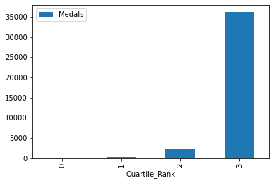
Same story, but more drastic.
Is it time to bring it all together? LET’S GO!
My first try at a scatter plot comparing country populations and gold medals!

If I logaritmatize both the x and y axes…
plt.scatter(Indicators_and_Medals['Population'],Indicators_and_Medals['Gold_Medals'])
plt.grid()
plt.xscale("log")
plt.yscale("log")
#Yeah, matplotlib now
(I learned that at https://www.bmc.com/blogs/matplotlib-logarithmic-scale/)
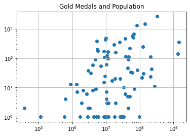
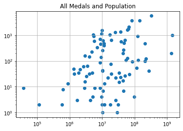
There seems to be some correlation between populations and gold medals. It’s as if a country’s maximum Gold medal count bounded by their population. But what about this…
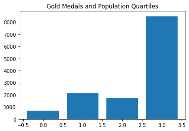
This is interesting. The third population quartile has more golds than the second… weird.
What about all medals?
Looks similar to before. Let’s see what the population quartiles say…
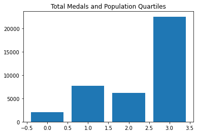
A similar story to the gold medals.
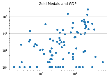
Higher GDP per capita indicates success, but bottom quartile includes China…
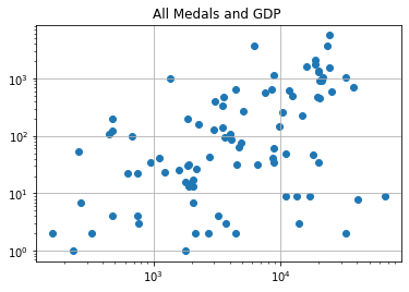
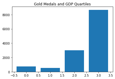
Same story.
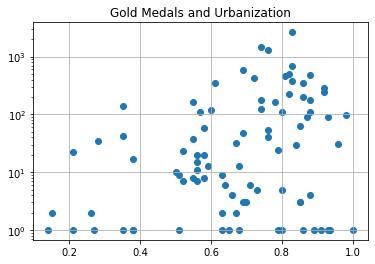
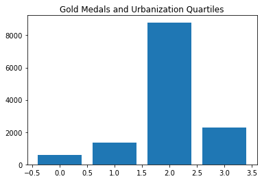
Ooooh. This looks interesting.
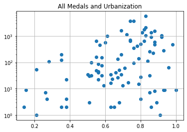
But…
So you want to be urbanized, but not too urbanized…
So what does Coursera want from me… doesn’t look like much. As always, they want far less than I’ve done…